In the logo design, the letter "M" is creatively shaped to represent two "A", with the addition of a horizontal line passing through the central part. This innovative approach in logo design creates a strong visual identity, making the logo distinctive and modern. The creation of the logo using the letter "M" as the basis for two "A" with the line allows for a balance between simplicity and sophistication, which is key in any custom logo creation process. In this case, the logo design is not only functional but also aesthetically striking, adaptable to all brand needs. This logo concept is a perfect example of how thoughtful logo design can build powerful visual symbolism and enable a brand to stand out in the market, reinforcing a strong professional brand identity.
The seahorse symbol in the logo represents strength, protection, and elegance, and is carefully integrated into the overall logo design. The focus in the logo creation process is on crafting a distinctive and meaningful symbol that communicates the core values of the brand. The logo design uses elegant lines and dynamic shapes, creating visual balance and sophistication that captures attention. Special attention is given to every detail during the logo creation process, ensuring that the logo is not only aesthetically appealing but also symbolic. The seahorse logo design reflects stability and resilience, while maintaining a modern and clean look that is easily recognizable. This custom logo creation not only meets the requirements for functionality and flexibility but is also highly applicable across various media, from digital platforms to printed materials, making it a powerful professional brand identity design for the brand.
In the logo design, the initial letter is enhanced by the addition of a vertical line extending above the base form of the letter, creating a distinctive arrow symbol. This element adds dynamism and direction to the logo, suggesting progress, focus, and determination. Through the logo creation process, the vertical line is not just an aesthetic addition, but also a key component that gives deep symbolic meaning. The logo design with the arrow element communicates ambition and a forward-looking focus, while maintaining simplicity and clarity. This logo creation with this element becomes a powerful visual identity that is easily recognizable across all media. Through careful shaping of every detail in the logo creation process, a logo has been created that is functional and flexible, ideal for application on both digital and print platforms, reinforcing a strong professional brand identity design.
The symbol is designed as a combination of the symbols for the two words – "dva/two" and "srca/hearts", which together create a unique visual identity. In the logo creation process, the symbol of "two" is depicted in a way that suggests connection, duality, and balance, while the "heart" element adds an emotional dimension and symbolizes love, passion, and care. This combination in the logo design creates a powerful message that communicates closeness and harmony. The logo design carefully combines these two components, using shape and proportions that ensure clear recognition and simplicity. Throughout the logo creation process, the symbolism of the two hearts united in the shape of the number "two" gives the logo deep emotional strength, while the logo design remains minimalist and efficient in all applications. This professional brand identity design allows the brand to stand out with its unique approach and strong visual message, easily recognizable across both digital and print media.
The initial letters of the logo are carefully combined into one, creating a recognizable logo mark. Throughout the logo creation process, every detail is meticulously designed to form a harmonious connection between the letters, giving the logo a unique visual identity. The logo design leverages the synergy between the initials, which merge into a unified shape, creating a mark that is simple yet powerful. This approach in custom logo creation ensures quick recognition and easy memorability, while simultaneously maintaining elegance and modernity. Throughout the entire logo creation process, the emphasis is placed on clarity and visual coherence, resulting in a logo design that easily adapts to various formats and media. The combined initial letters of the logo provide a strong foundation for the brand, giving it a solid visual base across all applications, from digital to print media, reinforcing a strong professional brand identity design.
In the logo design, the letter "M" is creatively shaped to represent two "A", with the addition of a horizontal line passing through the central part. This innovative approach in logo design creates a strong visual identity, making the logo distinctive and modern. The creation of the logo using the letter "M" as the basis for two "A" with the line allows for a balance between simplicity and sophistication, which is key in any custom logo creation process. This professional, custom logo design is not only functional but also aesthetically striking, adaptable to all brand needs. The clean lines and thoughtful arrangement create a seamless integration of form and meaning, ensuring that the logo resonates with its target audience. This logo concept is a perfect example of how a well-crafted, custom logo can build powerful visual symbolism, reinforce a strong professional brand identity, and enable the brand to stand out in the competitive market.
The initial letter of the logo is innovatively replaced with the number "1", creating a unique visual identity that reflects the company's leading position in the industry. Throughout the logo creation process, the number "1" becomes the central element, symbolizing excellence, uniqueness, and the ambition to be number one in its field. This number in the logo design also contributes to the clear and strong brand recognition, as the number "1" carries powerful symbolism and simplicity in its application. The logo design uses the number "1" as the initial symbol, which fits seamlessly into the overall form of the logo, giving it a modern and minimalist appearance. Throughout the logo creation process, special attention has been paid to ensuring that the number "1" is easily recognizable across all applications and media, whether digital platforms or printed materials. The logo design with the number "1" ensures the brand's visual strength and coherence, creating a logo that clearly communicates its position as an industry leader, reinforcing a strong professional brand identity design.

The initial letter "J" carries deep symbolism, as the word "ješka" in the Chakavian dialect means "bait," and the shape of the letter "J" resembles a hook, which further strengthens its meaning. In the process of creating the logo, the letter "J" becomes a central visual element, symbolizing precision, attention, and attraction – much like a hook catching its prey. This element in custom logo design creates a dual connection with the brand, symbolizing both the idea of attracting customers and a strategic approach to the market. The integration of the "J" as a hook conveys a strong message of quality, innovation, and efficiency, fundamental to professional brand design. Throughout the design process, special attention was given to ensuring the "J" and its hook symbolism were seamlessly incorporated into the overall brand identity, creating a logo that is adaptable to various platforms. This distinctive logo design strengthens the brand’s recognition, while maintaining a modern and minimalist appearance. The hook element makes the brand more attractive and memorable, ultimately establishing a powerful, coherent brand identity across both digital and print media.
In the logo design, the symbol represents the initial letter of the logo, which is carefully crafted to fully reflect the brand’s identity. However, as the shape develops, an interesting visual effect occurs: when the circle is closed, the symbol transforms into a recognizable basketball. This dual interpretation in the logo design creates a strong symbolism that connects the brand’s initial with dynamism, energy, and precision – traits that are characteristic of sports, particularly basketball. Through the custom logo creation process, special attention is given to ensuring that the shape remains fluid and flexible, allowing both meanings – the brand’s initial and the basketball – to be recognized. This logo design uses this combination of symbols and shapes to create a strong yet simple visual identity that is easily recognizable and understood across all media. This professional brand identity design delivers a powerful visual message to the brand, communicating a connection to a dynamic sport while also reflecting a unique identity that is memorable.
The logo creation process is built on strong symbolism that combines functionality with recognizability. In this logo design, the symbol of a boot is used, chosen for its connection to durability, stability, and reliability. The boot also symbolizes protection, resilience, and a readiness to face challenges, positioning the brand as a strong partner in the business world. Moreover, the initial "L" from the brand name "Ledenko" is seamlessly integrated into the design, becoming a core element of the symbol. During the custom logo creation process, special attention was given to ensuring the "L" blends perfectly with the boot, enhancing the connection between the symbolic strength of the boot and the brand’s identity. This thoughtful integration allows the logo to be both highly recognizable and unique, combining the initial letter with a symbol of great meaning. The overall result is a professional brand identity design that captures the essence of the brand while being adaptable and impactful across various media.
This logo design is built on the concept of balance and harmony, which are essential for crafting a stable and recognizable brand identity. In the professional custom logo design process, I use the initial letter, carefully shaped to become the central element of the design. This initial letter isn’t just static – it is innovatively transformed into the final character of the logo, rotated by 180° to form a new letter, specifically the letter "T". This unique approach in custom logo creation highlights the balance between simplicity and creativity. Rotating the letter adds dynamism and visual interest, while maintaining balance throughout the entire logo design. The letter "T" serves as the pivotal point connecting the elements, creating a harmonious and coherent overall visual identity. This logo creation process results in a professional brand identity design that is adaptable and impactful across all platforms.
In the logo design, the letter "M" is not only the initial of two key concepts but also carries a deeper meaning, associating with a men's suit and the human head. The creation of the logo uses the letter "M" as the central visual element, uniquely linking the brand identity with elegance and sophistication, while also incorporating a recognizable human feature. The shape of the letter "M" in this professional brand identity design evokes the cut of a men's suit, which can symbolize professionalism, style, and seriousness – essential characteristics often associated with both fashion and business. By adding a circle above the letter "M," the logo acquires an extra layer of symbolism: the circle transforms into a human head, giving the design a more personal dimension. This connection between the suit and the head represents a complete, well-dressed individual ready for the professional world, combining sophistication, fashion, and human elements into a unique visual identity. This custom logo creation beautifully integrates these symbolic elements, creating a powerful visual brand identity that speaks to both style and professionalism.

The logo design features a strong and recognizable symbol – stylized bull horns – representing strength, power, and determination. This symbol in the logo design reflects the core values of the brand: stability, courage, and an aggressive commitment to achieving goals. The bull's horns, with their imposing presence, create a visually striking mark that mirrors the brand's unyielding character and its ability to face challenges in the market. The creation of the logo with this symbol has been carefully executed to make the bull horns the central element of the design, giving the logo a powerful character. Every line and shape of the stylized horns reflects precision and attention to detail in the logo creation process. By incorporating these horns, the custom logo creation results in a logo that is not only visually impactful but also carries deep meaning, effectively communicating the brand's mission and philosophy. This approach in professional brand identity design allows the brand to stand out as a symbol of resilience and strength.
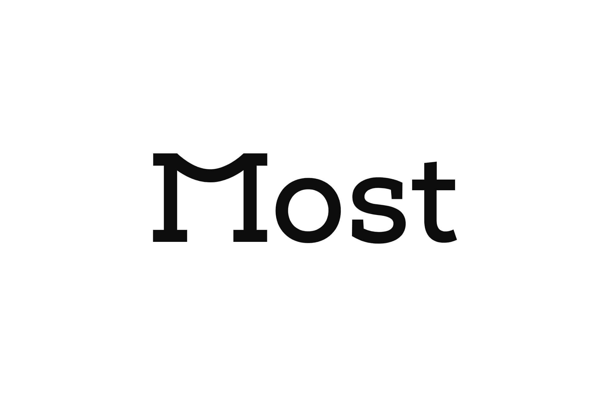
The initial letter of the logo, "M", plays a pivotal role as it symbolizes a bridge – a symbol of connection, transition, and strength. In the custom logo creation process, using the letter "M" as a bridge creates a strong visual metaphor that reflects the ability to unite people, ideas, and resources. This logo design, with its symbolic element, emphasizes the mission to be a bridge between different markets, ideas, and communities. The logo design with the initial "M" that evokes a bridge highlights the commitment to connecting and guiding toward shared goals. The bridge is a symbol of stability and resilience, and through this design, the brand becomes a metaphor for lasting and secure connections with clients and partners. The bridge also suggests transition, progress, and transformation, positioning the brand as an industry leader that facilitates innovation and advancement. This logo design, as part of the professional brand identity design, reflects the brand's role in leading change and creating meaningful connections.

In this logo design, the initial letter "n" is carefully crafted and connected to the element of a foot, which clearly associates with the clinic's specialization in treating injuries and conditions of the musculoskeletal system. The custom logo creation integrates the foot within the letter itself, creating a recognizable visual identity that directly communicates the clinic's expertise and mission. Through this logo design, the professional brand identity design becomes a symbol of focus on rehabilitation, treatment, and patient care. The logo design with the initial "n" and the added foot clearly reflects the commitment to providing expert medical assistance, particularly in orthopedics and physiotherapy. The foot, as a symbol of movement and balance, aligns perfectly with the clinic's mission to help patients regain physical functionality and quality of life. Additionally, the shape of the foot can also symbolize the clinic's core function as a foundation and a safe space for treating all musculoskeletal issues. This logo design effectively conveys both the clinic's specialized focus and its dedication to improving patients' well-being.
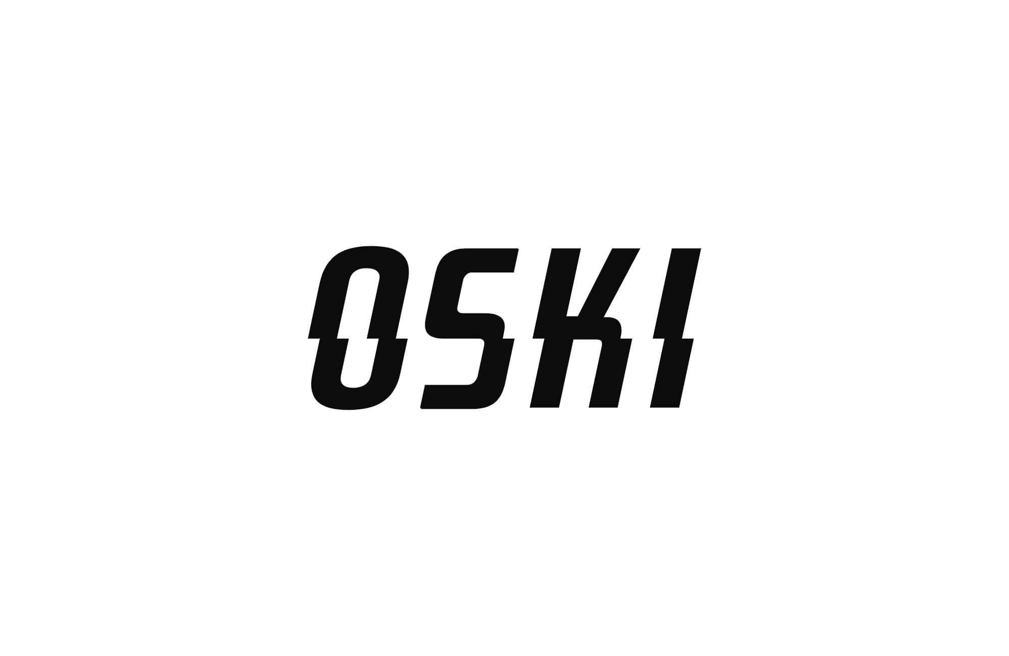
The logo design features an innovative division into two horizontal sections, symbolizing strength, dynamism, and energy – key aspects of the brand – while also connecting with the theme of electrical energy. This division is not just an aesthetic element but also a powerful metaphor pointing to technology, energy, and progress. Through this custom logo creation, the design establishes a visual identity that communicates modernity, innovation, and stability, while simultaneously reflecting the energy that drives the brand. The logo design, with two horizontal lines separating the components, creates a strong visual impact. These lines may evoke a graphic representation of electrical circuits or energy waves, further emphasizing the connection with electricity and high-tech solutions. This division in the logo not only introduces dynamism into the design but also symbolizes the balance between power and control – two essential components in the world of electrical energy, reinforcing a solid professional brand identity.
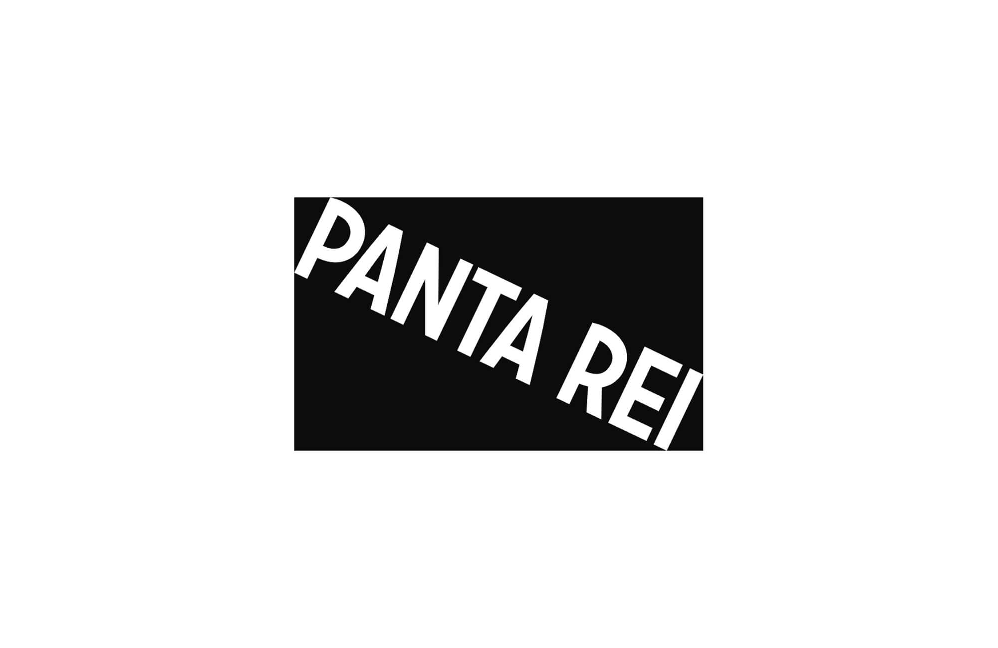
The key visual element in this logo design is a rectangle with a white diagonal line, referencing the flag of sports and recreational diving. The custom logo creation incorporates this symbol to reflect the brand’s connection with the diving community and its mission to promote sports and recreational diving. The diagonal line within the rectangle represents dynamism, movement, and freedom, which are characteristic of this sport, while simultaneously reflecting the technical precision and discipline that are crucial in diving activities. The logo design uses this line as a visual leitmotif, with the original white diagonal line from the flag replaced by the association's logo, creating a recognizable and unique visual identity. This detail symbolizes the association’s connection with the diving community and its commitment to the development and promotion of sports diving as an activity that unites a love for the sea, sports, and nature – reinforcing a strong professional brand identity.
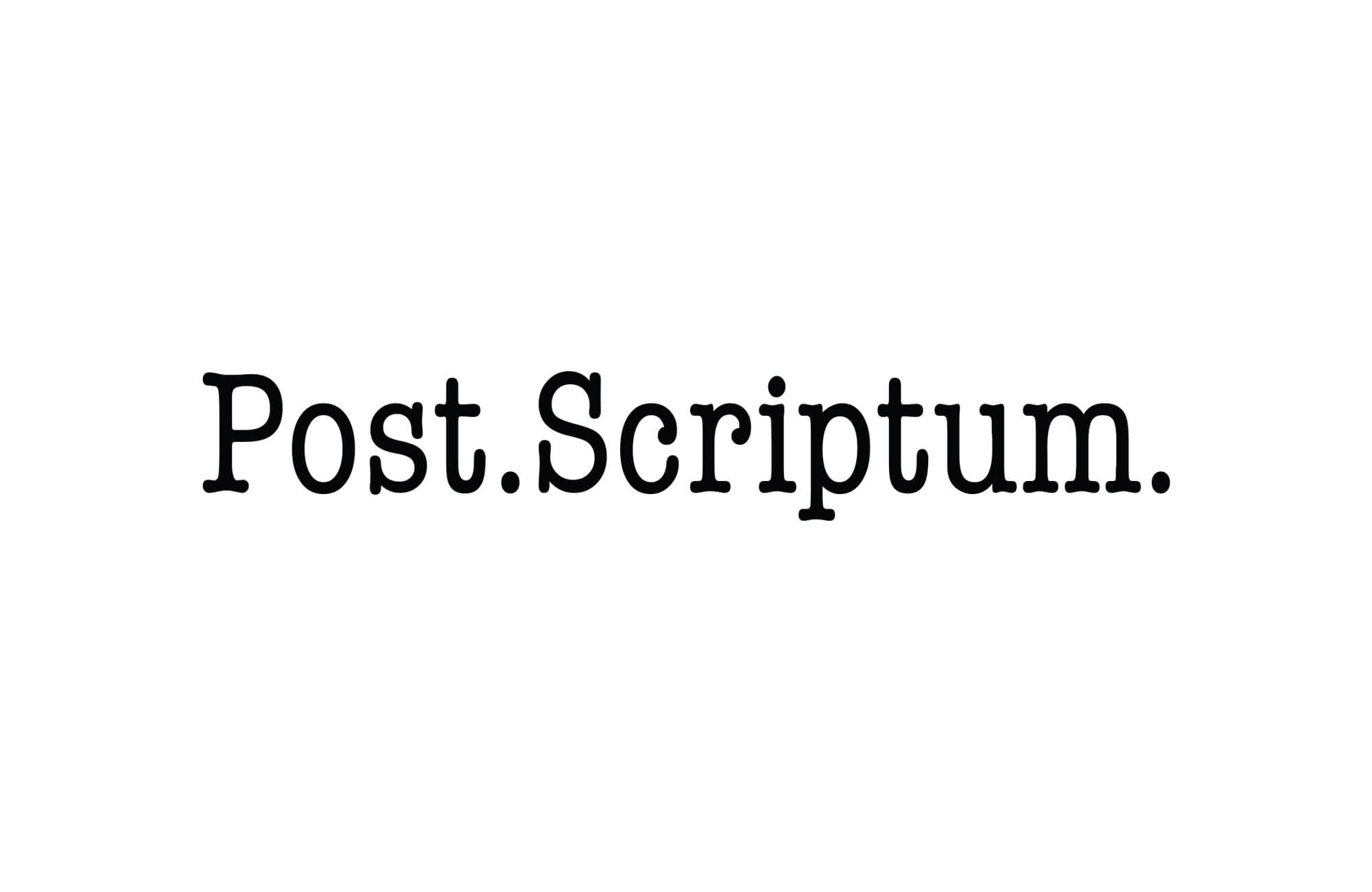
In this logo design, the dots play a central role as a symbol of subsequent thoughts, or Post Scriptum (P.S.), representing an addition that comes after the letter has been completed. The custom logo creation uses dots to convey the idea that the brand always has more to say, just like Post Scriptum adds final thoughts after everything else has been said. The dots introduce an element of dynamism, suggesting that there is still room for new ideas, innovations, and additions, even when everything seems finished. The logo design with dots highlights flexibility, constant evolution, and the ability to keep adding value. In this context, the dots symbolize an opening to new possibilities – like space for further thoughts, conclusions, or actions. The use of dots in the logo can also be a metaphor for details and precision, as each dot carries a specific meaning and contributes to the overall professional brand identity.

The initial letter of the Retrospective logo is carefully rotated, symbolizing the meaning of the term itself – "looking back". The custom logo creation uses this design technique to emphasize the importance of reflecting on the past, analyzing experiences, and lessons that have shaped the brand or organization. The rotated "R" reflects the ability to look back in order to make wise decisions for the future, while simultaneously creating visual dynamism that aligns with the idea of retrospective insight. The logo design with the rotated initial "R" also suggests flexibility and adaptability of the brand. Since a retrospective involves analyzing past events and learnings, this element in the logo design highlights the company's or organization's ability to adapt and grow, learning from the experiences it has gained. The rotated letter also symbolizes the cyclical nature of time and business processes, where the past, present, and future merge to shape ongoing growth and development, reinforcing a professional brand identity.

The initial letter in this logo design is carefully shaped to resemble an elephant's trunk, while the dot next to it symbolizes an eye. This powerful visual element combines two key associations: the strength and wisdom of the elephant, and the precision and attentiveness connected to visual perception of the world. The custom logo creation using the initial graphic in the shape of an elephant's trunk immediately evokes a sense of power, stability, and protection, as elephants in many cultures symbolize these traits. The elephant’s trunk, with its long, flexible, and strong nature, represents the brand as a symbol of perseverance, the ability to face challenges, and resilience. This logo design speaks to the core values of strength and endurance, highlighting the brand's ability to overcome obstacles with wisdom and stability, making it a professional brand identity that resonates deeply across all applications.
The initial graphic in this logo design is shaped to represent an owl, a well-known symbol of the island of Šolta. The custom logo design incorporating the owl motif draws on the symbolism of this beautiful and mysterious bird, often associated with wisdom, knowledge, and careful observation. The owl, as a symbol of Šolta, adds deep meaning to the brand identity, as it is known for being a nocturnal hunter, capable of precise and thoughtful action, perfectly aligning with the values the brand seeks to communicate. This logo creation with the owl-shaped initial not only reflects wisdom but also connects to the natural heritage of the island of Šolta. The owl, in many cultures, symbolizes insight, introspection, and a strong bond with nature, making this logo ideal for a brand focused on preserving the natural environment and traditional values, while simultaneously looking toward the future with a thoughtful and wise approach. This professional brand identity design highlights a perfect balance between nature conservation and forward-thinking innovation.

The logo is based on the historical evolution of the town's name, Stobreč, whose original name was "Sanctus Laurentius", meaning "Laurentius, crowned with laurel". This custom logo design draws on this historical context to create a strong symbol that connects the town's past with its present. Over time, the town's name went through several stages of abbreviation, first becoming "Stlovreč", then "Stovreč", and finally, the current "Stobreč". The logo creation incorporates elements that reflect this historical shortening of the name, with the diacritical mark on the final letter, "č", replaced by two leaves. These leaves in the logo symbolize the laurel wreath, referencing the original meaning of the name "Laurentius" – "crowned with laurel". The laurel wreath, as a symbol of glory and victory, adds deep meaning to the logo design, connecting the town to its rich cultural and historical heritage. The design integrates these elements to create a professional brand identity that highlights Stobreč unique connection to its past while making a timeless, recognizable mark for the future.
In this logo design, the key element is the innovative combination of the initial and final letter "T", which forms the letter "M" in the middle. This unique visual approach not only creates an aesthetically pleasing shape but also carries deep symbolic meaning related to the brand's identity. The custom logo creation process uses this element to represent creativity, innovation, and the dynamic nature of the brand. The use of two "T" (the initial and final) merging in the middle to form an "M" symbolizes the connection of different aspects of the business into one cohesive entity. This professional brand identity design communicates a strong message about synergy and integration, while emphasizing the importance of balance between the various parts of the brand.
The letter "X" holds a dual meaning: it not only represents the initial of the brand name but also symbolizes human legs and arms holding a weight in the air. The logo design featuring this element creates a strong visual connection between the brand and the concept of strength, balance, and physical endurance. The "X" in the logo design outlines human arms and legs in a horizontal position, which can be associated with someone performing a physical activity, such as acrobatics, gymnastics, or another form of physical expression requiring balance or holding weight in the air. This motif clearly communicates strength, agility, and control, as only someone in peak physical condition can achieve such balance and sustain weight in the air.

The key typographic change was the removal of horizontal strokes in the letterforms, giving the logo a more modern and minimalist appearance. The logo design that incorporates this typographic adjustment creates a strong visual impact by emphasizing clarity, simplicity, and the strength of the lines. This typographic modification allows the brand to stand out through a clean, geometric design that is both elegant and easily recognizable. Removing the horizontal strokes in the letters contributes to a sense of openness and transparency. With no unnecessary elements, the logo design becomes simpler yet stronger, as the focus shifts to the essential lines that form the distinctive shapes of the letters.
The letter "Z" has been carefully chosen as a key symbol representing two neighboring countries. In this custom logo design, the letter "Z" becomes a symbol of connection, collaboration, and unity, emphasizing the relationship between two neighboring nations that share similar interests and values. Through this symbol, the idea of synergy and mutual understanding is visually expressed, strengthening the foundation for further cooperation and development at all levels. This professional brand identity design captures the essence of partnership, creating a powerful and memorable logo that communicates a sense of shared goals and progress.